Chapter 2 A taster - making your first map
2.1 Overall goal of the chapter
In this book we will take you step-by-step through making maps with African data in R. In this taster chapter we will demonstrate some of the steps so that you can get an idea of what we are aiming for and see that it is achievable. This taster chapter will not explain everything, that will come in later chapters. Don’t worry if there are things that you don’t quite understand at this stage. You should at least be able to run the code that we provide, see that it makes map, and have some idea what it is doing.
Learning objectives
- Gain an indication of what the book will enable you to do
- Start to become familiar with R code to make maps
- Revise & understand concepts of packages, functions & data objects in R
- See that maps can be made in R with relatively little code
To be able to make maps in R you will need to install and load some R packages that contain functions and data.
In the examples below we use the R package called tmap to create several different map types including static and interactive ones. With tmap, multiple shapes and layers can be plotted on a single map and its appearance can be changed quickly with many different styles and options to choose from. Below we present some key features and functionalities of the package, while more detailed information is presented in the next chapters.
2.2 Hello Africa!
When learning to code something new it is good to start simple. “Hello World!” is often the first example used to teach a programming language - just enough code to print that welcoming message. Given the aim of this book we adapt the concept slightly, changing the geographic focus and presenting a map rather than text.
# install packages
# install.packages("tmap")
# install.packages("remotes")
# remotes::install_github("afrimapr/afrilearndata")

# load packages
library(tmap)
library(remotes)
library(afrilearndata)

# plot a map of Africa country boundaries
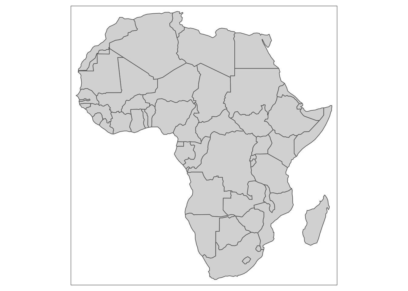
tm_shape(africountries) + tm_polygons() 
Figure 2.1: A map of African countries boundaries
For this ‘Hello Africa!’ example we use the tm_shape and tm_polygons functions from the tmap package to make a map of African country boundaries using a data object called africountries from the afrilearndata package. We don’t expect you to understand the code completely at this stage but the example should give you an idea of what each part is doing.
In R there is often more than one way of doing a task. This ‘Hello Africa!’ example can also be created using the mapview package and the same data.
# install packages
# install.packages("mapview")

# load packages
library(mapview)
library(afrilearndata)

# plot a map of Africa country boundaries
mapview(africountries)
The mapview package makes interactive maps so that on a computer the viewer can zoom in and out and drag the map to different areas. It also provides an automatic basemap. These things can be done with tmap too - as we said, there is often more than one way of doing a similar task.
Both maps above simply plot the geographic boundaries.
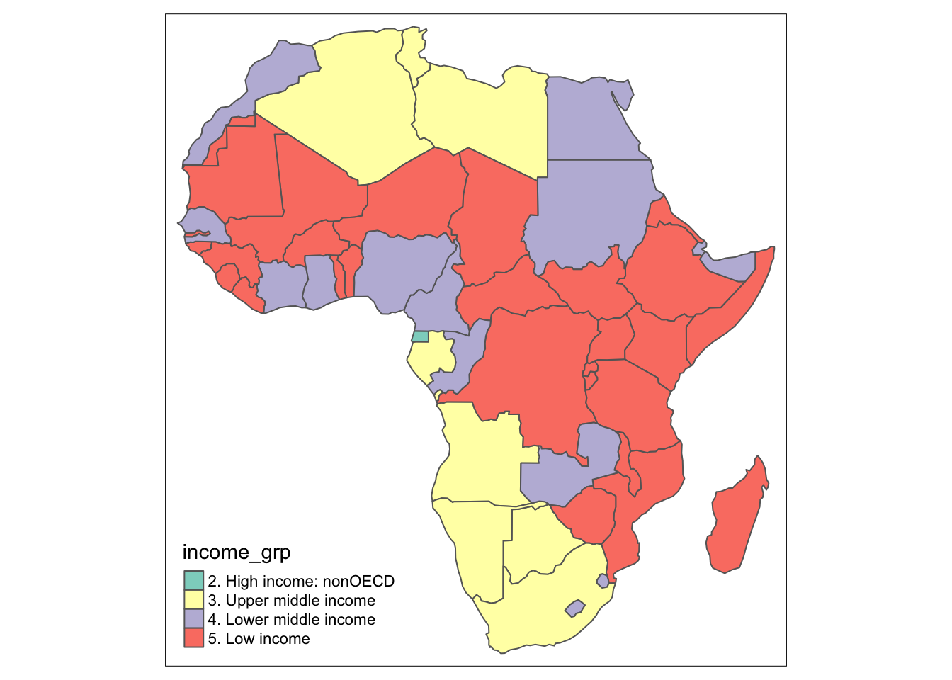
We can add just a little code to each example to visualise some other data using the geographic boundaries as a canvas. In this case we will use income_grp which is a column within the africountries data object.
Firstly, using tmap :

Figure 2.2: A map of African income groups.
Secondly, using mapview :
[andy TODO: is it useful adding mapview above? trying to show early that you can use more than one approach & syntax is similar, also not to be too reliant on just one package, do I want to add more below]
The tmap package is frequently used in geospatial visualisations because it allows us to quickly and easily create both, static and interactive maps. The syntax of tmap resembles that of ggplot2 which is a popular data-visualising package. Both use layers to include additional elements in the map and both follow a strict separation between the data and the aesthetic of the map. Firstly, the dataset is provided in tm_shape() function and additional layers of the map are specified through the use of a + sign followed by different functions, depending on what we want to add. There are several display specification to choose from such as:
tm_polygons(): draws the polygonstm_fill(): fills the polygons with a specified colour (Grey is a default option.)tm_borders(): draws the borders of the polygonstm_lines(): draws spatial lines eg. roadstm_dots(): draws points eg. capital citiestm_symbols(): draws symbols, with grey circles as a default option.
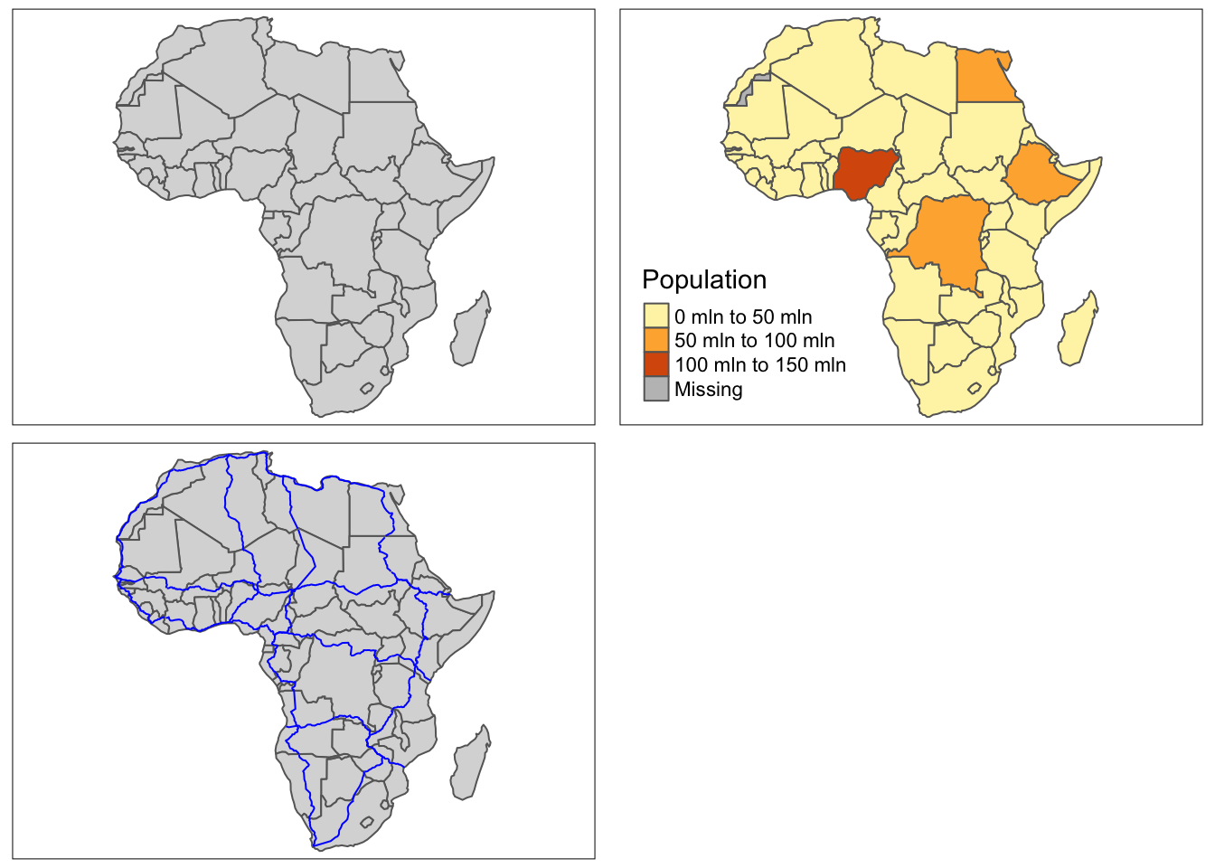
They enables us to add and customise the map. Below we present two examples of how tmap is used to create simple static and interactive maps. In the code below, africountries is our dataset, an object of sf class, whereas tm_polygons() and tm_lines() are used to plot and adjust polygons and lines, respectively.
2.3 Static maps
map_1 = tm_shape(africountries) +
    tm_polygons()

map_2 = tm_shape(africountries) +
    tm_polygons(col = "pop_est", title = "Population")

map_3 = map_1 +
  tm_shape(afrihighway) +
    tm_lines(col = "blue")

tmap_arrange(map_1, map_2, map_3)
Figure 2.3: An example of static maps.
Furthermore, the creation of an interactive map is equally convenient, where it only requires “turning on” of an interactive mode by changing from “plot” to “view” in the tmap_mode() function, as seen in the example below.
2.4 Interactive maps
## tmap mode set to interactive viewing