Chapter 5 Visualising spatial data part 1: tmap and mapview
5.1 Overall goal of the chapter
In the previous chapter we explored different types of spatial data and looked at how these can be used to create a map. In this section we will use tmap and mapview packages to create both static and interactive maps. In particular, we will focus on the goals presented below.
Learning objectives
- Create static and interactive maps using different packages
- Learn function structure to build more advanced maps
- Analyse the differences between used packages and identify their applicability for various purposes
This chapter requires the following packages (some of them we used already):
cran_packages_to_install <- c(
"mapview", # map-making package for interactive maps
"tmap", # map-making package for static and interactive maps
"tidyverse", # metapackage containing dplyr, ggplot2 and other packages
"sf", # package for working with spatial data
"tmaptools" # map building package
)
install.packages(cran_packages_to_install)
#remotes::install_github("afrimapr/afrilearnr")
remotes::install_github("r-spatial/mapview@develop")
remotes::install_github("afrimapr/afrilearndata")Next, we need to load the packages:
5.2 Quick interactive maps with mapview
The mapview package allows you to quickly and easily create interactive maps using spatial data. Therefore, it is useful when we want to quickly explore the data visually without excessive care about the quality of the presentation. However, if you need static maps or interactive maps which are more elaborate you might want to consider other options such as tmap package which will be presented later in this chapter.
Moreover, a potentially important aspect to consider is whether the map should be interactive at all. Even though powerful R packages allow us to produce interactive maps quickly and (nearly) effortlessly, it is important to align the purpose of the map with its appearance and functionality. This will ensure that the interactivity does not impede reader’s interaction with the map and helps conveying key information easily. For example, it is important to consider target audience of the map. If the map is for the specialists then the interactivity will potentially help gaining more in-depth insights into the data and finding more detailed, micro-scale information, beyond the trends identifiable at first sight. However, if the map is published for broader audience to provide an overview of a certain situation easily and quickly, then a static map is probably a better medium. At the end of the day the features included in the map should help the author of the map communicate with the reader. Therefore, the type, functions and appearance of the map should be in line with the amount and level of information to be presented, the purpose of the map and the level of expertise of the reader.
As we now shortly discussed the advantages and disadvantages of using the interactive maps, let us have a look on the how they can be created. Firstly, it is important to say that the typical spatial objects types supported by mapview package are:
- sf objects which is “a collection of simple features that includes attributes and geometries in the form of a data frame” (Saddler, 2021).
- raster data made of pixels, where each pixel represents a geographical location
To create the most basic, interactive map with the boundaries of African countries you need to call mapview() function
This map has a number of functions:
- layer button to switch between five different layers
- scale bar
- zoom buttons
- data name in the top right corner
You can easily fill an interactive map with the colours based on one of the columns. Here we use population column to colours our map. Importantly, when you hoover over specific country the population data for a given country is showed.
Similarly, you can control for other features such as line width (lwd) or colour of polygons (col.regions). Another important feature that you might want to control is the underlying map which we set with map.types argument. The available background maps can be viewed here.
mapview(africountries, color = "red",
lwd = 1.5, col.regions = "white", map.types = "Esri.WorldShadedRelief")Further, mapview allows you to easily build up many layers within a single map. Here, we firstly include countries and then add location of airports. Further a useful option is layer.name where you can control the naming of different layers of the map. The specific layers can be adjusted as showed in the example. In particular, we set the colour of countries polygons according to the population size. It is possible to use layer button to hide and unhide layers of the map.
# simple map with two layers
mapview(list(africountries, afriairports), layer.name = c("Countries", "Airports"))#map with advanced layers options
mapview(africountries, zcol = "pop_est", layer.name = "Population") +
mapview(afriairports, layer.name = "Airports location")Finally, mapview supports also raster data format, and if visualised it will appear on top of the background map, as showed in the simple example below. We can adjust the transparency of raster layer using argument alpha.region.
The link to full documentation is available in Further resources section.
Exercise 1: Create a map with two layers: countries and capitals. Fill the country polygons according to income group. Explore the layers button to hide and unhide some of them.
5.3 Static maps with tmap
In this section we explore the potential of tmap in creating static maps, which is a flexible, yet user-friendly package. Its syntax is similar to ggplot2 (plot-making package), where additional features of the map are simply built up on top of the basic structure. Before you plot the first maps you need to activate static map viewing mode and (if necessary) read in your dataset.
Next, we create an empty contour map of the continent, where tm_shape() function serves as a basic component containing the shape object i.e. our spatial dataset. On top of this basic element we can then add more layers using + operator. The advantage of tmap package is that it offers a large variety layers and these are named relatively intuitively to make the search and use easier. For example, we will now use layer called tm_borders() which defines the borders of the polygons. Further, we create an empty, border-less map using tm_fill() which defines the fill of the polygons.
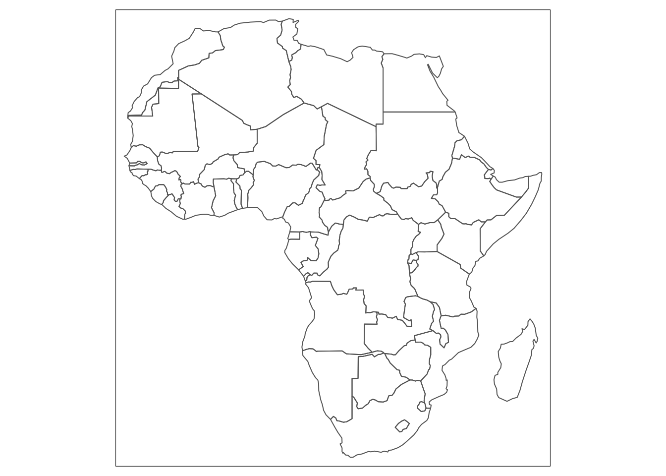

Figure 5.1: Basic types of maps.
Intuitively, to create a map with both layers, we need to include tm_fill() and tm_borders() simultaneously. Alternatively, tm_polygons() function allows you to achieve exactly the same result more efficiently. It draws the polygons borders and fills them at the same time. The choice of the approach will depend on type of data and information that you aim to present on your map. For example, if you plan to add a layer of road or rail network to your map later it may be a better idea to create a base map using polygons only (without borders) so that they do not overlap with road lines making the map more difficult to read.

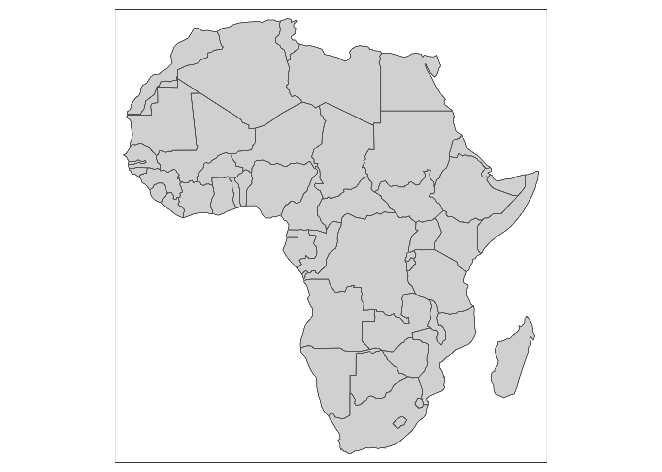
Figure 5.2: Identical maps achieved with two different approaches.
Nevertheless, we can further develop our map by adjusting different features of the map such as colour and transparency of the map, width and types of the border lines etc. This approach can also be used to help distinguishing different elements of the map. Following the example from above, the lines representing region borders and roads can be coloured differently to avoid confusion.
Polygon colours and other aspects of their appearance can be set directly e.g. col = "green", lty = "dotted".
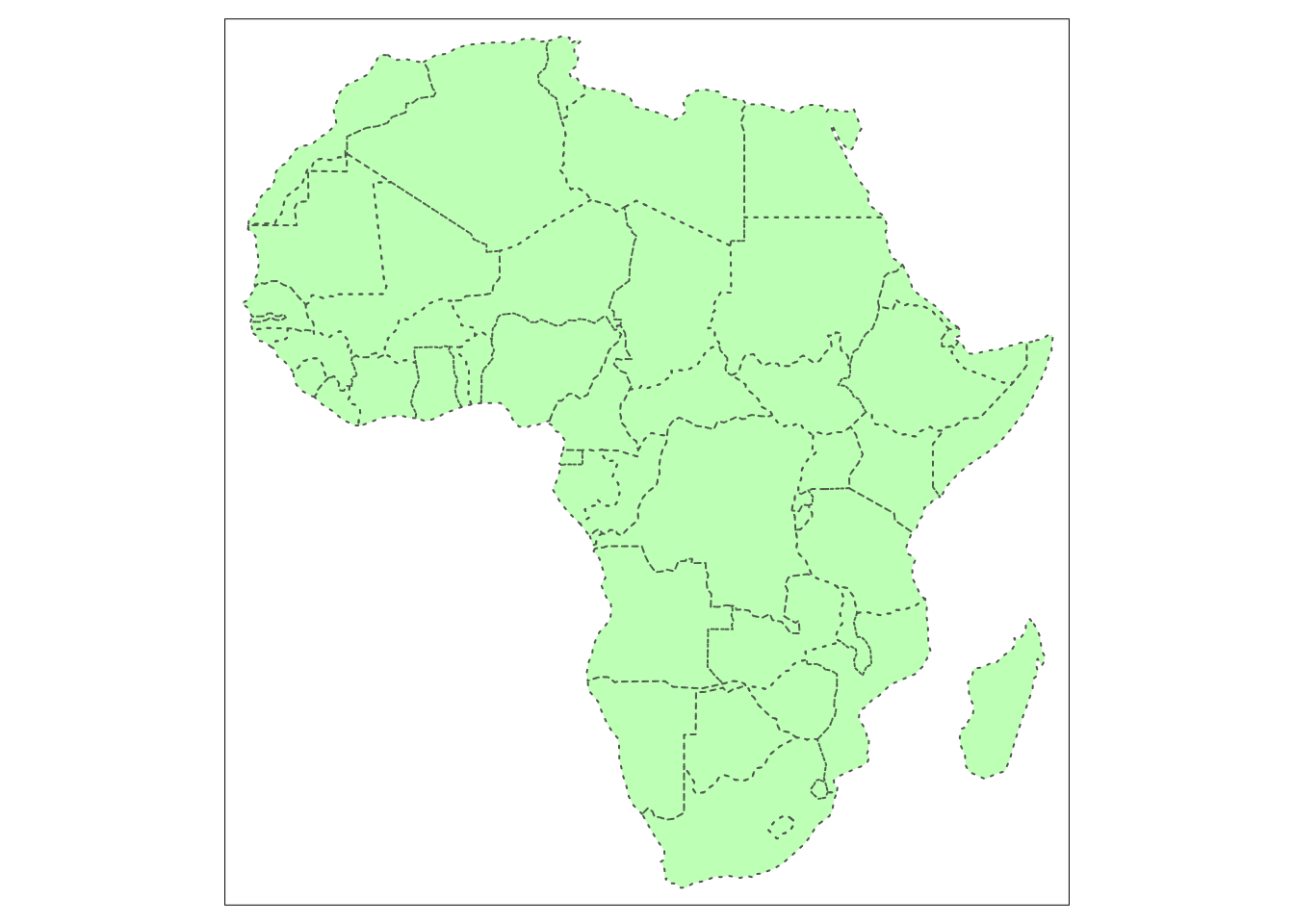
Figure 5.3: A map setting colour (col), line type (lty) and transparency (alpha).
More usefully the appearance of map elements can be set according to the values stored in one of the data columns. In the case below we set the colour according to the date of the last census which is stored in the column called lastcensus. We do this by specifying col="lastcensus". In this case the year labels in the legend get formatted with a ‘,’ (e.g. 1,970) so we can add a legend.format argument to improve. Further, you can build on the previous map by adding labels for country names with tm_text() function. In a similar manner a variety of different layers can be added. Even though the possibilities are nearly endless, where large number of elements and layers can be combined in a single map, care should be take in order not to overwhelm the reader with the amount of information presented in one map and impede clarity and readability.
tm_shape(africountries)+
tm_polygons(col = "lastcensus", title = "Year of last census",
legend.format = list(fun = function(x) formatC(x, big.mark="")))+
tm_layout(scale = 1.25) # increases the overall size of the legend
tm_shape(africountries)+
tm_polygons(col = "lastcensus", title = "Year of last census",
legend.format = list(fun = function(x) formatC(x, big.mark="")))+
tm_text("name", size = 0.52, fontface = "bold", auto.placement = TRUE)+
tm_layout(scale = 1.25) 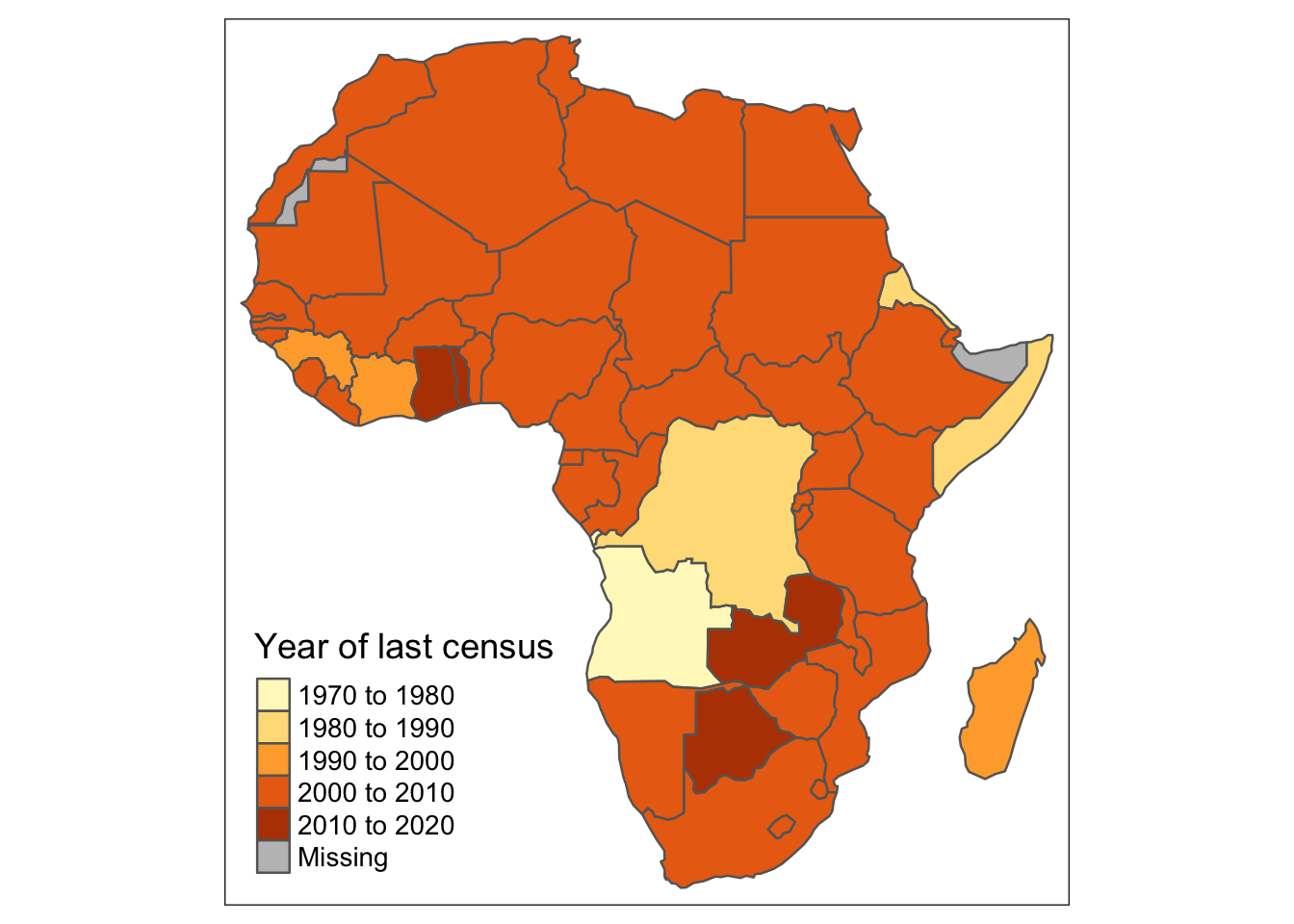
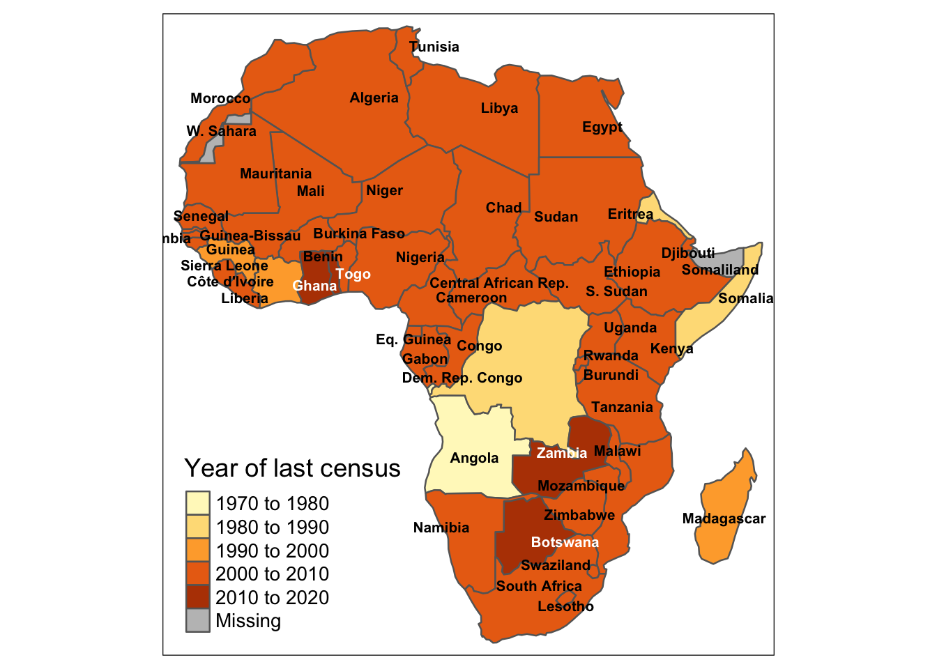
Figure 5.4: Basic map without labels (left) and map with added country names and formatted legend years (right).
Another useful function in tmap is the adjustment of the intervals in the legend, in case the default scale does not provide enough variety. For example, plotting the population of African countries on the map using default intervals (stemming from the data) is not very informative due to too much clustering of information. Instead, we might want to use breaks argument to set them up manually and provide more visual differentiation. For the transparency of the code, we set up the customised breaks outside of the map-making function. Alternatively, you can control number of so-called bins (groups) into which the Population is divided, by setting n argument to a desired number of bins inside the tm_polygons() function.
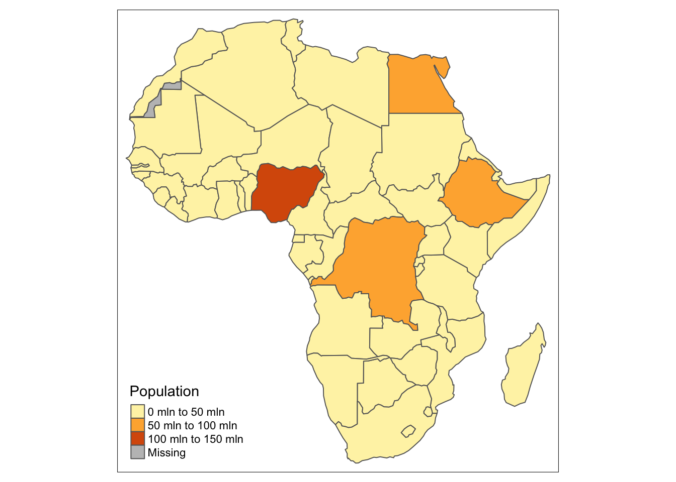
Figure 5.5: A map of African population with default breaks settings.
#set up breaks manually
custom_breaks = c(0, 1, 4, 7, 10, 30, 50, 70, 100, 120, 150, 180, 200) * 1000000
tm_shape(africountries) +
tm_polygons(col = "pop_est", title = "Population", breaks = custom_breaks)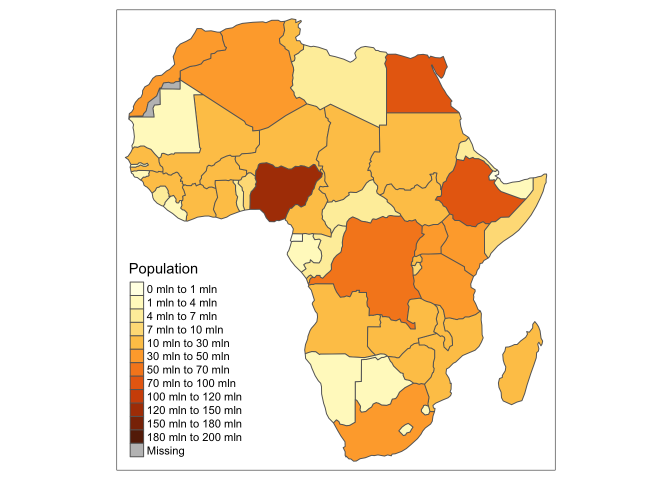
Figure 5.6: A map of African population with customised breaks settings.
#set up a number of bins
tm_shape(africountries) +
tm_polygons(col = "pop_est", title = "Population", n = 15) +
tm_layout(scale = 0.9)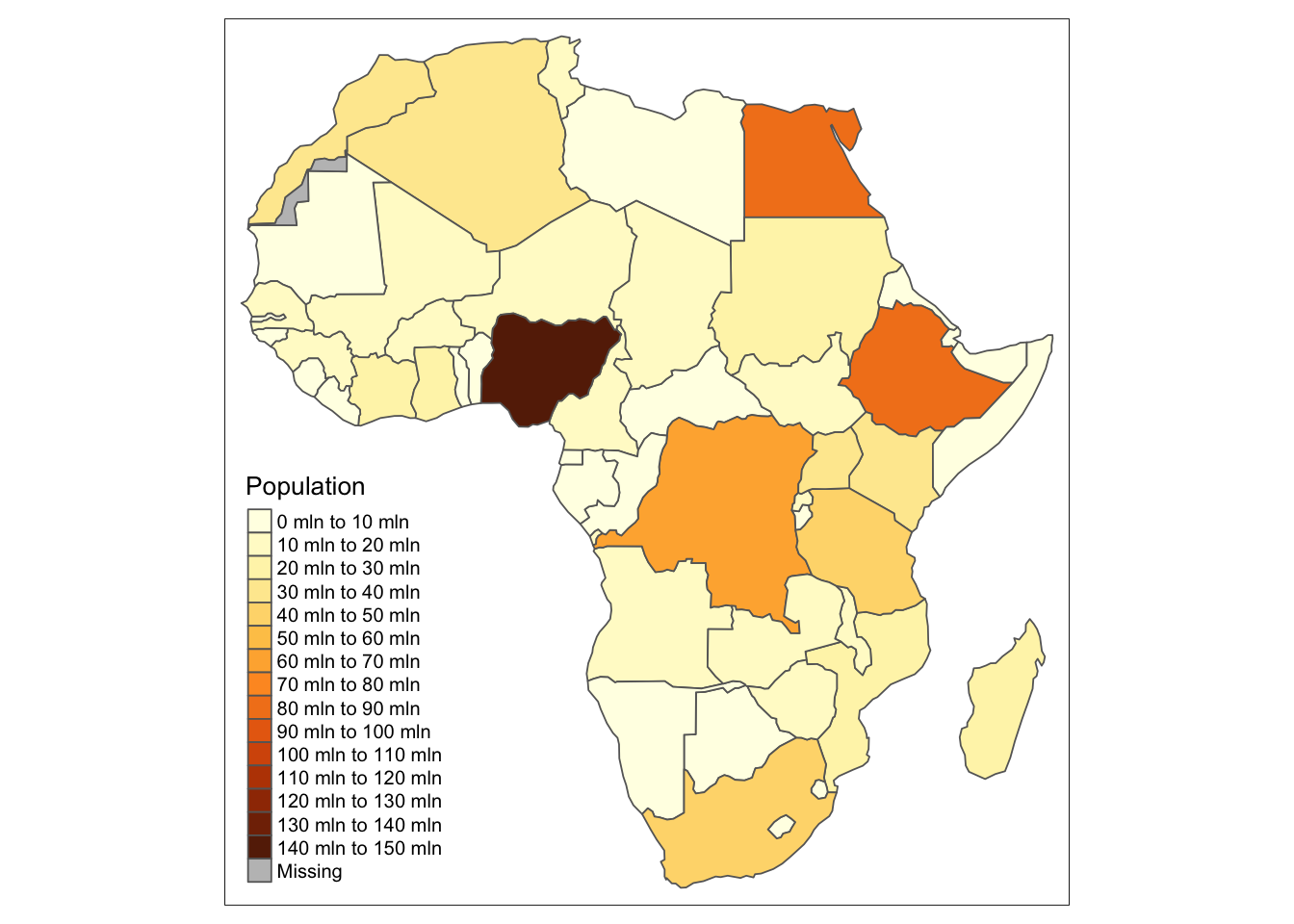
Figure 5.7: A map of African population with bins for breaks settings.
Another case where adjusting the breaks is key are often raster data of population due to clustered distribution of the data. To demonstrate this, let’s have a look at the histogram of afripop2020 which is a dataset containing raster data of African population. As you can see in the graph, the shape of the data distribution is exponential, with large number of data points with low population and low number of highly populated data points. This, then, has certain implications for the visualisation.
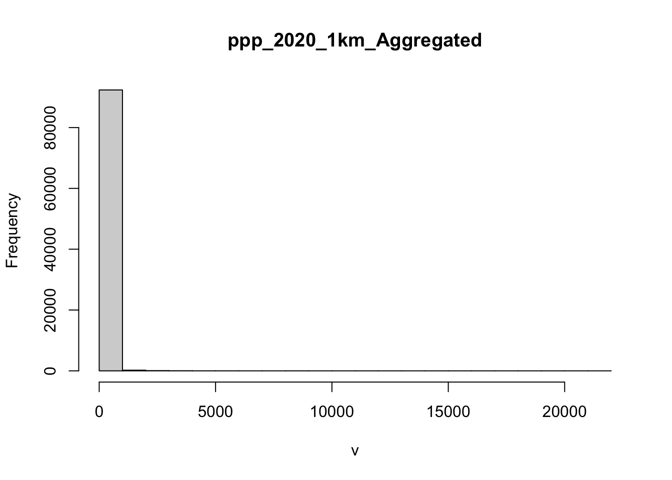
Figure 5.8: A histogram of African population distribution.
If we use the default breaks in the map of African population, it is clear that there is not enough differentiation for the map to be readable, as seen below. Outside of the map legend we included the histogram to show data distribution.
data(afripop2020)
tm_shape(afripop2020) +
tm_raster(legend.hist = TRUE)+
tm_layout(legend.outside = TRUE)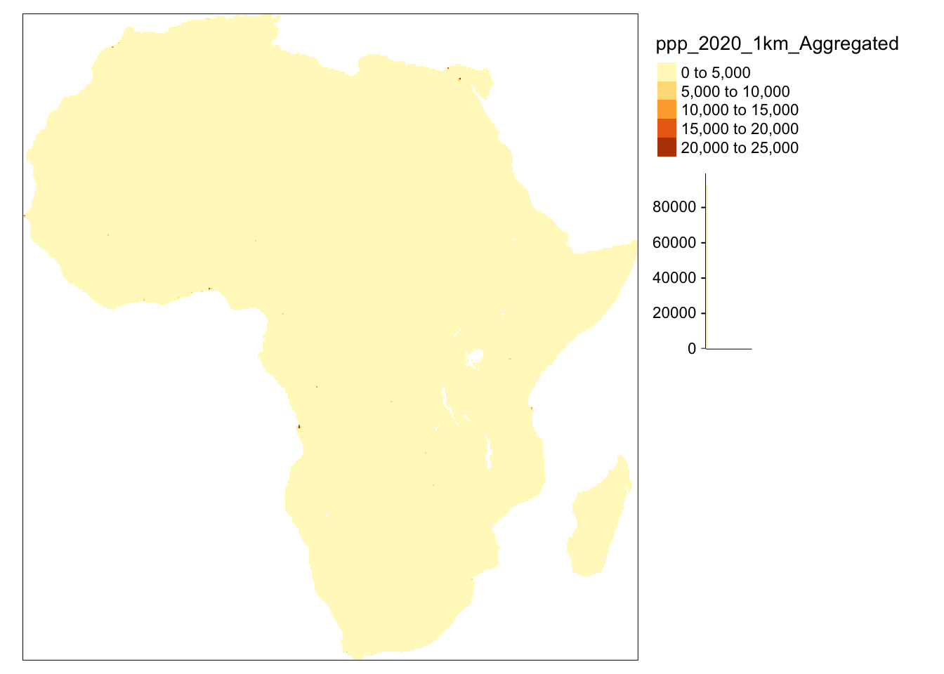
Figure 5.9: A map of African population with raster data, using default breaks settings.
Therefore, customised breaks are a way to address this problem. For this, we set up breaks first, outside of the map-making code and then we use them within the map-making code. This allows us to achieve better readable map and clarity. The histogram of data is presented below the map legend.
raster_breaks=c(0,1,10,100,1000, 25000)
tm_shape(afripop2020) +
tm_raster(breaks = raster_breaks, legend.hist = TRUE)+
tm_layout(legend.outside = TRUE)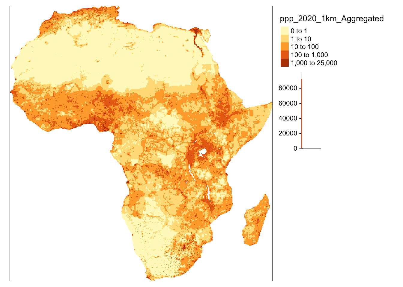
Figure 5.10: A map of African population with raster data, using customised breaks settings.
Furthermore, the differences between levels of population density represented with raster data can be further emphasised by modifying a colour palette. In the example below, we specified it using palette argument within tm_raster function. We take a closer look at the functionalities of palette in the next section.
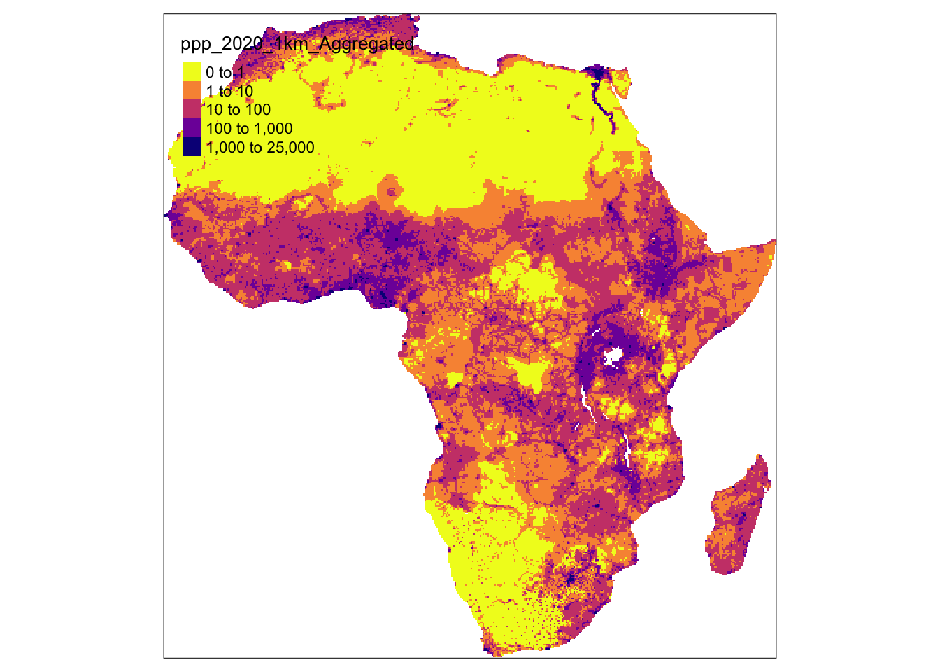
Figure 5.11: A map of African population with raster data, using customised palette.
So far, we used continuous variables to fill the polygons but it is also possible to use categorical variables for this purpose. In the example below income_grp variable is a categorical variable that contains information about the income level. It allows for visual grouping of countries in the same category. The names of the categories in the legend were adjusted using labels argument. In the similar manner you can group and present the airports of Africa depending on their size.
tm_shape(africountries)+
tm_polygons(col = "income_grp", title = "Income levels", alpha = 0.6,
labels = c("High", "Upper middle", "Lower middle", "Lower"))+
tm_layout(scale = 1.25)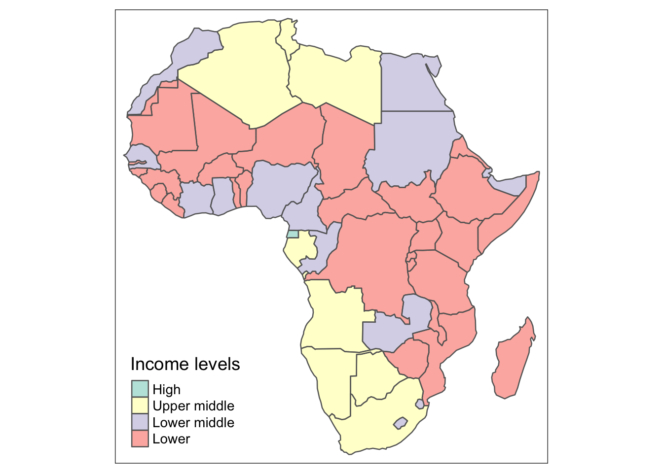
Figure 5.12: A map of income groups as categorical variables.
data(afriairports)
tm_shape(africontinent)+
tm_polygons(col = "lightyellow")+
tm_shape(afriairports) +
tm_dots(col = "type", shape = 21, size = 0.2, title = "Airport size",
labels = c("Large", "Medium", "Small"),
palette=c(large_airport='red', medium_airport='yellow', small_airport='blue')) +
tm_layout(scale = 1.25)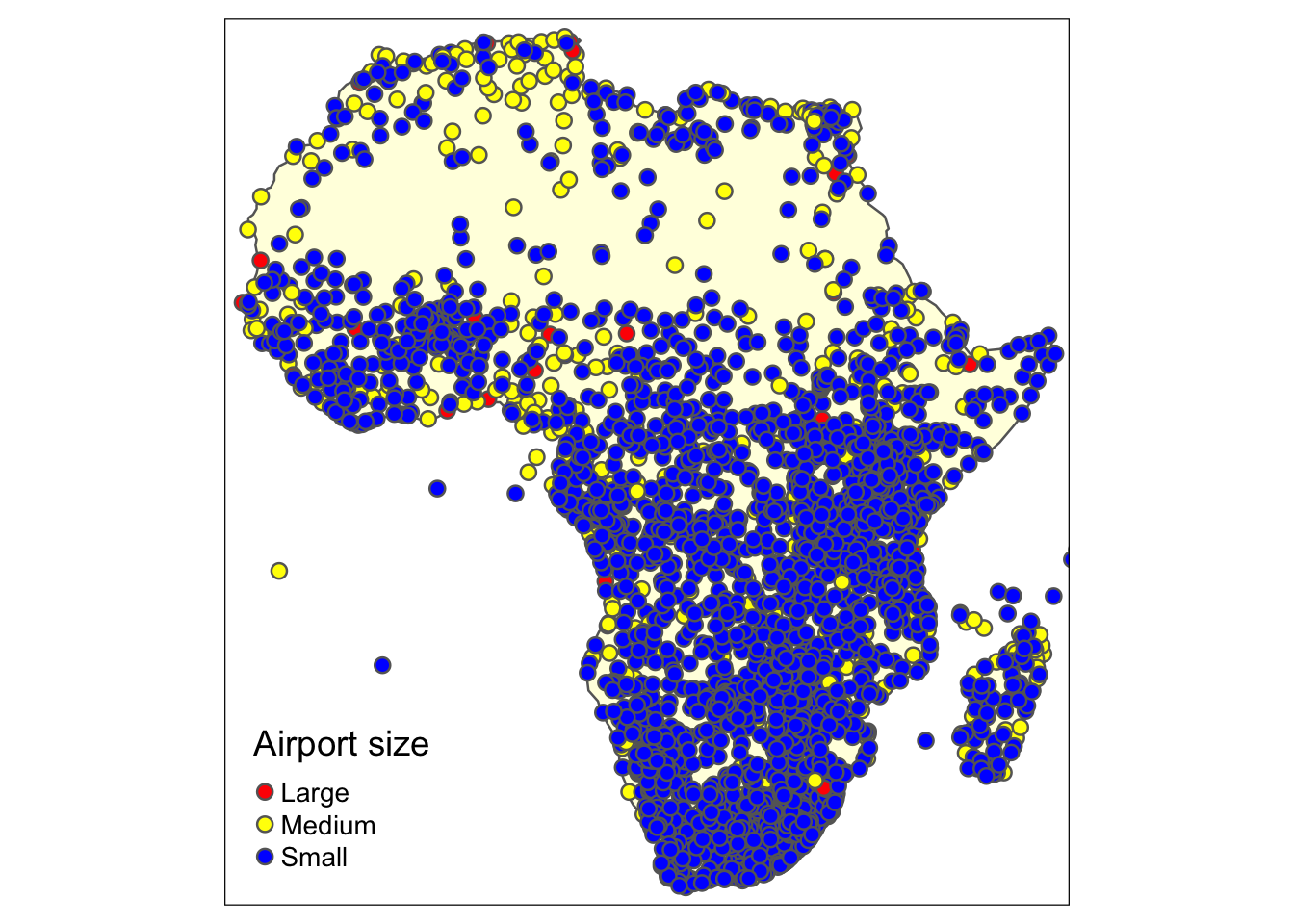
Figure 5.13: The African airports - an example of categorical variables visualisation.
It is important to bear in mind that some information can be displayed on the map in many different ways. For example, we can make use of tm_bubbles() to create so-called bubbles which size is linked to the population of each country while their colour represents the income group of the country.
tm_shape(africountries)+
tm_polygons(col = "lightyellow") +
tm_bubbles(size = "pop_est", col = "income_grp",
title.col = "Income level", title.size = "Population")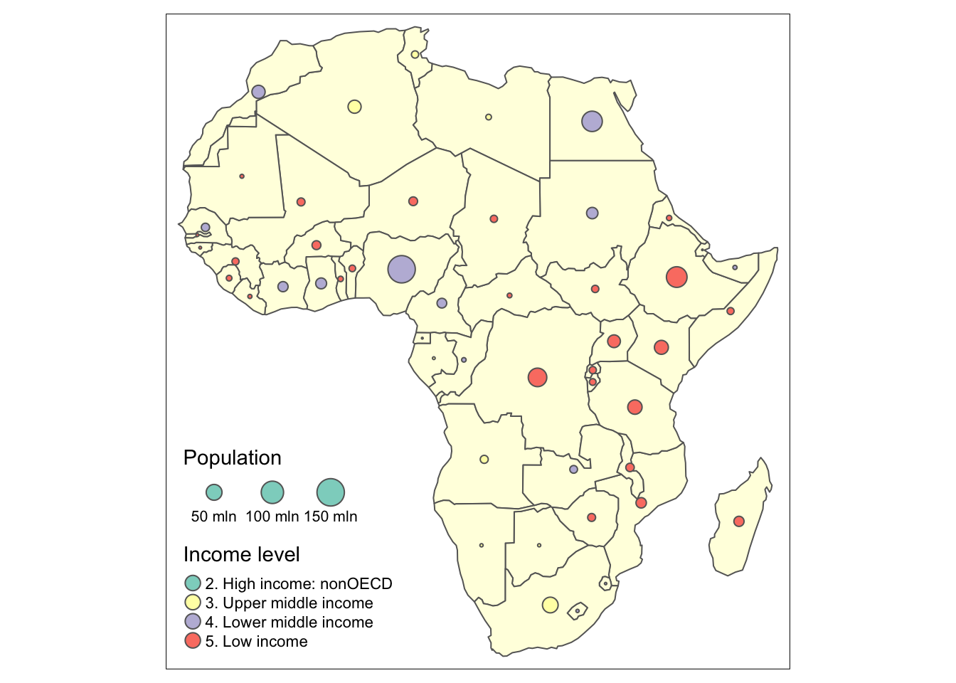
Figure 5.14: The African airports - an example of categorical variables visualisation.
5.3.1 Colour setting and colour pallete
An important aspect of the maps, as in every visual representation, are the colours. Beyond their aesthetic function, they come from a long tradition where they served as a primary mean to encode data on the maps. Consequently, they used to be called “visual variables” as they were a key for an accurate interpretation of the information on the map (https://morphocode.com). It is, therefore, important to find the balance when using colours to not obscure the data. Following, morphocode.com, you should take into consideration three features of the colour, namely, its hue, saturation and lightness. Hue is the mental association of a given colour e.g. we associate blue with cold and red with hot. Next, saturation can be defined as colour intensity and lightness is a relative amount of light that seems to reflect from an object compared to white elements. These perceptual dimensions of the colours have their practical functions in map-making process. Typically, hue is used to demonstrate the categorical data so that each discrete category has a different colours e.g. green, blue and red. Secondly, scalar values (e.g. from the hottest to the coldest temperature) are usually well depicted using different colour lightness and saturation (e.g. from bright red to pale red).
Another important aspect in terms of colour use is the design of the map for the individuals with colour vision deficiency. They can differentiate between different lightness however specific colours used for different categories may be less accessible for them. The solution could be an addition of texture or usage of pallets which are colour-blindness friendly. In fact tmaptools allows for testing chosen map colours for three different types of colour blindness in its color blindness simulator (accessible via tmaptools::palette_explorer()), as seen in the Figure 4.15.
Figure 5.15: The colour palette.
Moreover, tmap package has a broad colour selection, not only with respect to individual colours but also map styles where you can change the default colours using palette argument. In the example below, we used palette called Set1 and plasma but there are many other options to choose from. To view them, in your console run tmaptools::palette_explorer() which will open a new window with a wide range of palettes. Sliders on the left hand side allow for selecting a number of colours.
set1 = tm_shape(africountries)+
tm_polygons(col = "lastcensus", title = "Year of last census", palette = "Set1",
legend.format = list(fun = function(x) formatC(x, big.mark="")))
plasma = tm_shape(africountries)+
tm_polygons(col = "lastcensus", title = "Year of last census", palette = "plasma",
legend.format = list(fun = function(x) formatC(x, big.mark="")))
tmap_arrange(set1, plasma)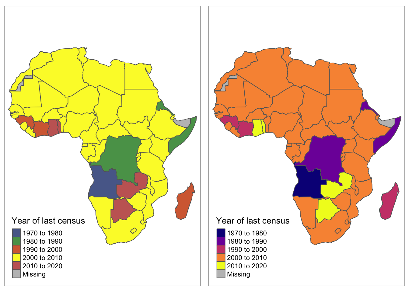
Figure 5.16: Maps of Africa using different pallete options.
Alternatively, an overall style of a single map can be easily changed using tm_style() function. However, it might also be useful to change the style in all the maps in the document. This can be achieved with setting the style globally with tmap_style("nameofthestyle"). The default style is called “white”, hence to restore a default style setting use tmap_style("white").
classic = tm_style("classic")+
tm_shape(africountries)+
tm_polygons()+
tm_bubbles(size = "pop_est", col = "income_grp", title.col = "Income level",
title.size = "Population", labels = c("High", "Upper middle", "Lower middle", "Lower"))+
tm_layout(scale = 0.8)
beaver = tm_style("beaver")+
tm_shape(africountries)+
tm_polygons()+
tm_bubbles(size = "pop_est", col = "income_grp", title.col = "Income level",
title.size = "Population", labels = c("High", "Upper middle", "Lower middle", "Lower"))+
tm_layout(scale = 0.8)
albatross = tm_style("albatross")+
tm_shape(africountries)+
tm_polygons()+
tm_bubbles(size = "pop_est", col = "income_grp", title.col = "Income level",
title.size = "Population", labels = c("High", "Upper middle", "Lower middle", "Lower"))+
tm_layout(scale = 0.8)
tmap_arrange(classic, beaver, albatross)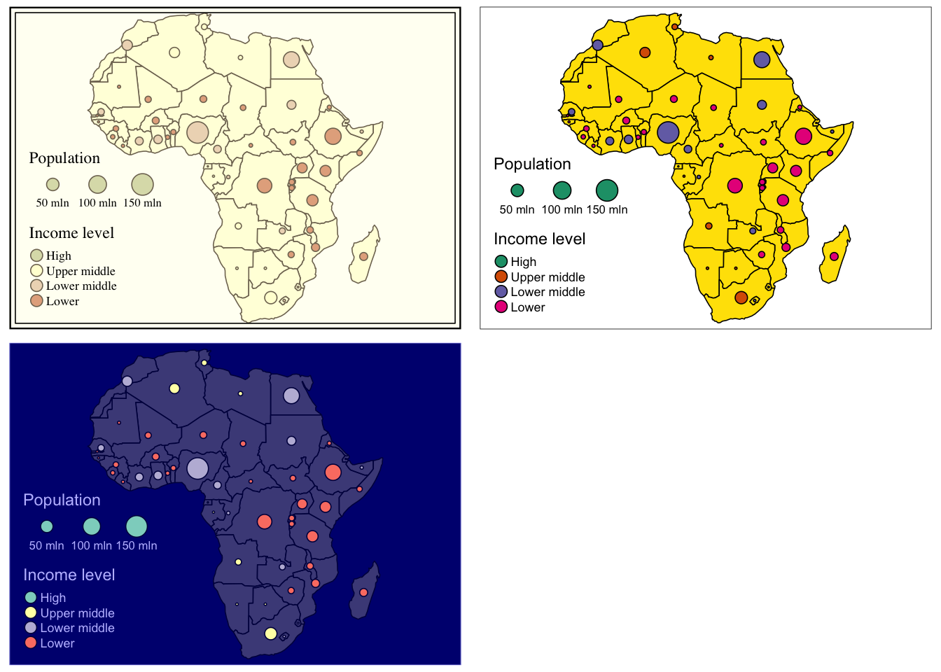
Figure 5.17: Examples of different styles.
5.3.2 Visualising different datasets in a single map
The tmap package not only allows you to add extra layers to a single map by building on a basic structure, but it also enables you to join two separate datasets in a single map. We, first, create an object called countries which is a map with African countries.
#read in data
data(africountries)
#create an object
countries = tm_shape(africountries)+
tm_polygons(col = "lightblue", alpha = 0.3)
#view object called "countries"
countries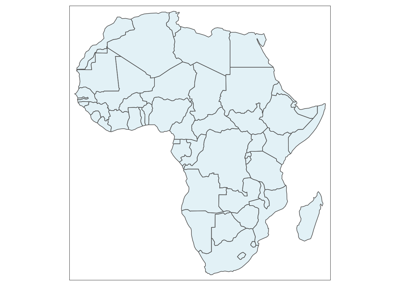
Figure 5.18: Base map with African countries.
Then, we use it as an argument to merge it with a map containing the location of capitals.
#read in data with capitals
data(africapitals)
#merge two maps
countries +
tm_shape(africapitals)+ #uses dataset with capitals
tm_dots(col = "red", size = 0.15)+ #adds dots on the map
tm_layout(title = "Capital cities of Africa", title.position = c("right", "top"), title.size = 1) #add and adjust map title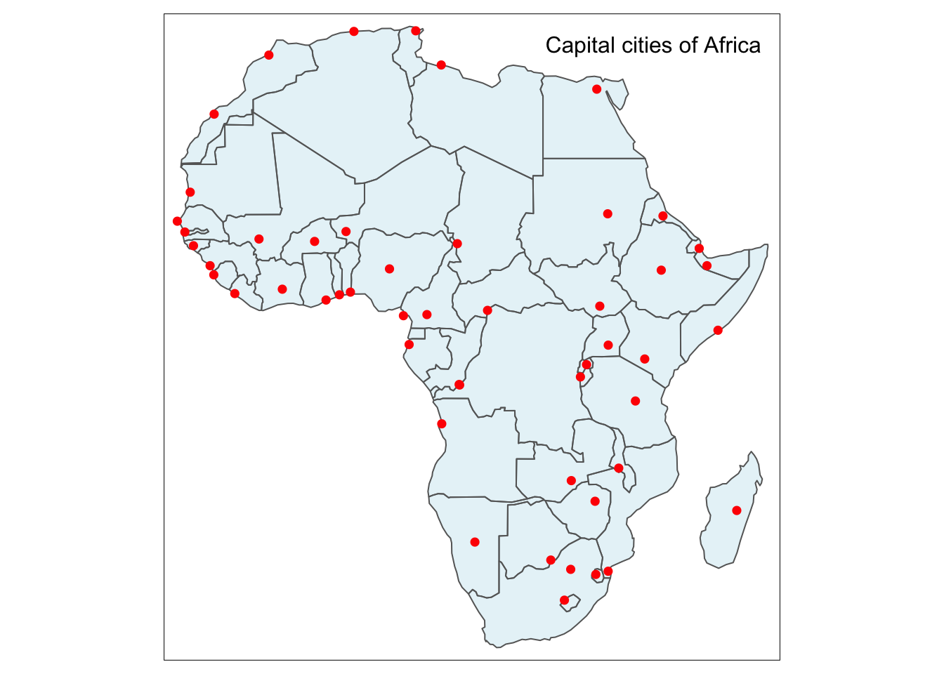
Figure 5.19: Base map with capital cities.
We can also mix different types of data in a single map, for example, raster and vector data. Nonetheless, here care needs to be taken in terms of the order in which we use the data. Raster data should be specified first as otherwise it would cover any subsequent data. In this regard, raster data works like a background colour. For example, we can visualise the population of Africa (raster data) and then add main highways (vector data) of the continent. In the tm_raster function we can specify the breaks and palette colour for the raster layer and in the the tm_lines we set up the colour separately for vector data, in this case highway lines.
raster_breaks=c(0,1,10,100,1000,25000)
tm_shape(afripop2020) +
tm_raster(breaks = raster_breaks, palette = rev(viridisLite::rocket(5))) +
tm_shape(afrihighway) +
tm_lines(col = "blue")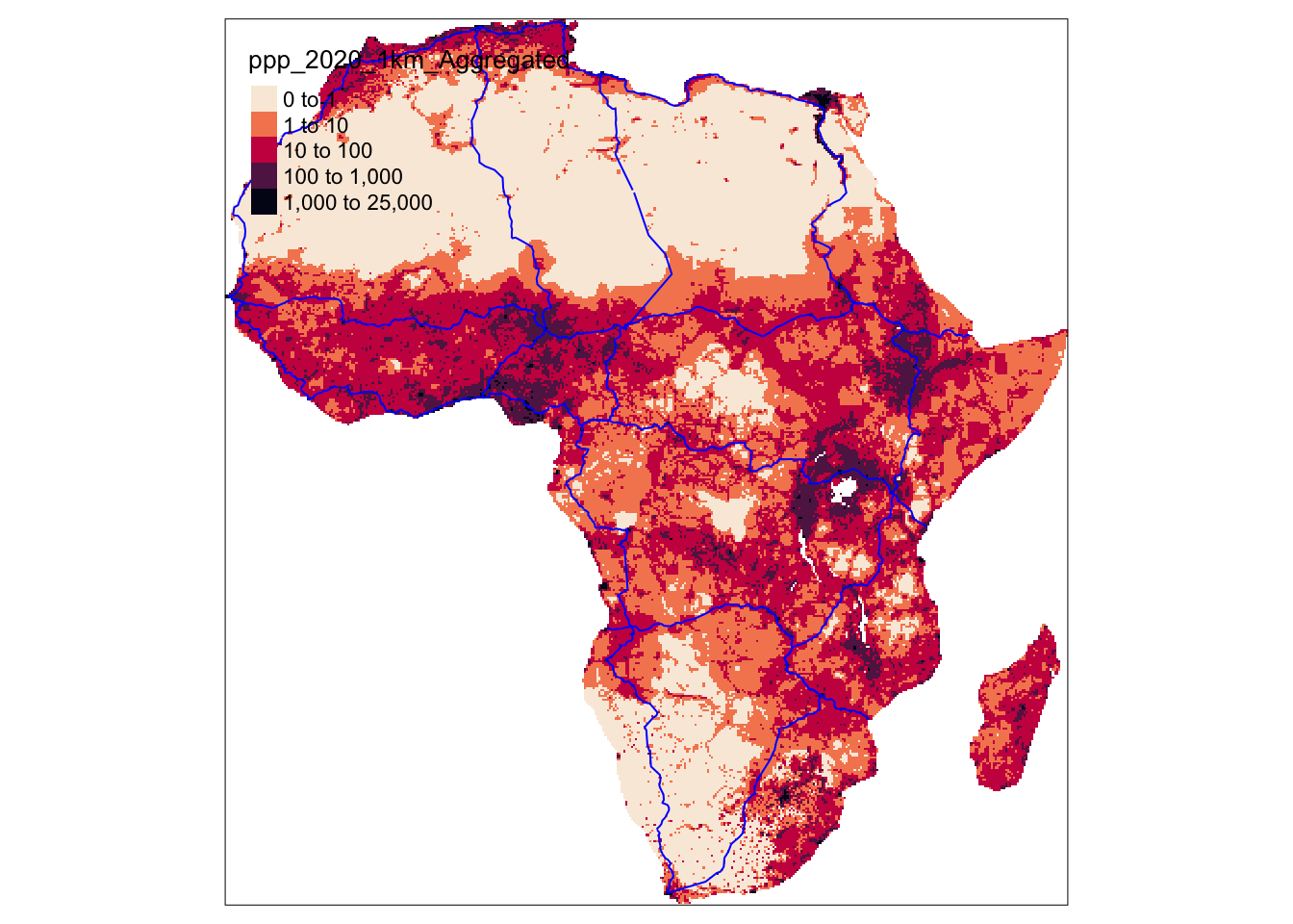
Figure 5.20: Raster data and vector data visualised in a single map.
5.3.3 Visualising subsets of data
So far we visualised whole datasets, now let’s assume that we are only interested in the subset of our data, for instance, a specific country or the airports of a specific size only. In this section we will present two ways of subsetting attribute-based subsetting and spatial subsetting.
5.3.3.1 Attribute subsetting
We can achieve it using dplyr package which offers a function filter() to subset rows within the dataset. We present how this can be achieved on an example, where we aim to create a subset of data containing only large airports. Consequently we filter them based on their size. This process of subsetting can be decomposed into smaller steps. Firstly, we create a new dataset called large_airports which is based on the subset of data from the original dataset called afriairports. The data is subset using so-called pipe operator %>% that essentially links two arguments in the sequence. Here, %>% links our original dataset with the subsequent function filter(). The filter() function allows us to subset variables or dataset that meet our condition specified inside it. Specifically, we selected all the airports from the whole dataset which are large, based on the type variable which contains large_airport observations that correspond to our airports of interest (large ones).
Next, we simply visualise two datasets in a single map. In the first step, we use africountries inside the tm_shape() function to create a base map of Africa. We specify that borders should be displayed with tm_borders(). In the second step we add new large_airports dataset with tm_shape(large_airports) and we specify that airport (from the large_airports dataset) should be visualised as red dots tm_dots(col = "red").
## tmap mode set to plottingdata(afriairports)
#take a subset of data
large_airports = afriairports %>% filter(type=="large_airport")
#plot the subset
tm_shape(africountries)+
tm_borders()+
tm_shape(large_airports)+
tm_dots(col = "red")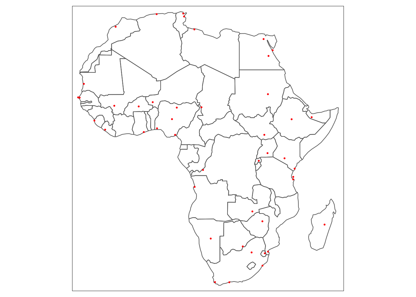
Figure 5.21: Two datasets visualised in a single map.
Another useful, subsetting example may be to visualise only information for one, specific country. This can be done using similar approach as presented above. In our example, we will focus on presenting airports of Egypt. Firstly, we take the dataset that contains all the airports (3348 observations in total) and create a new dataset called egypt which contains only the airports located in Egypt (66 observations in total). In the second step we create a map of the whole Africa coloured in beige and then overlay the Egyptian airports as blue dots.
egypt = afriairports %>% filter(country_name == "Egypt")
tm_shape(africountries)+
tm_polygons("beige")+
tm_shape(egypt)+
tm_dots(col = "blue")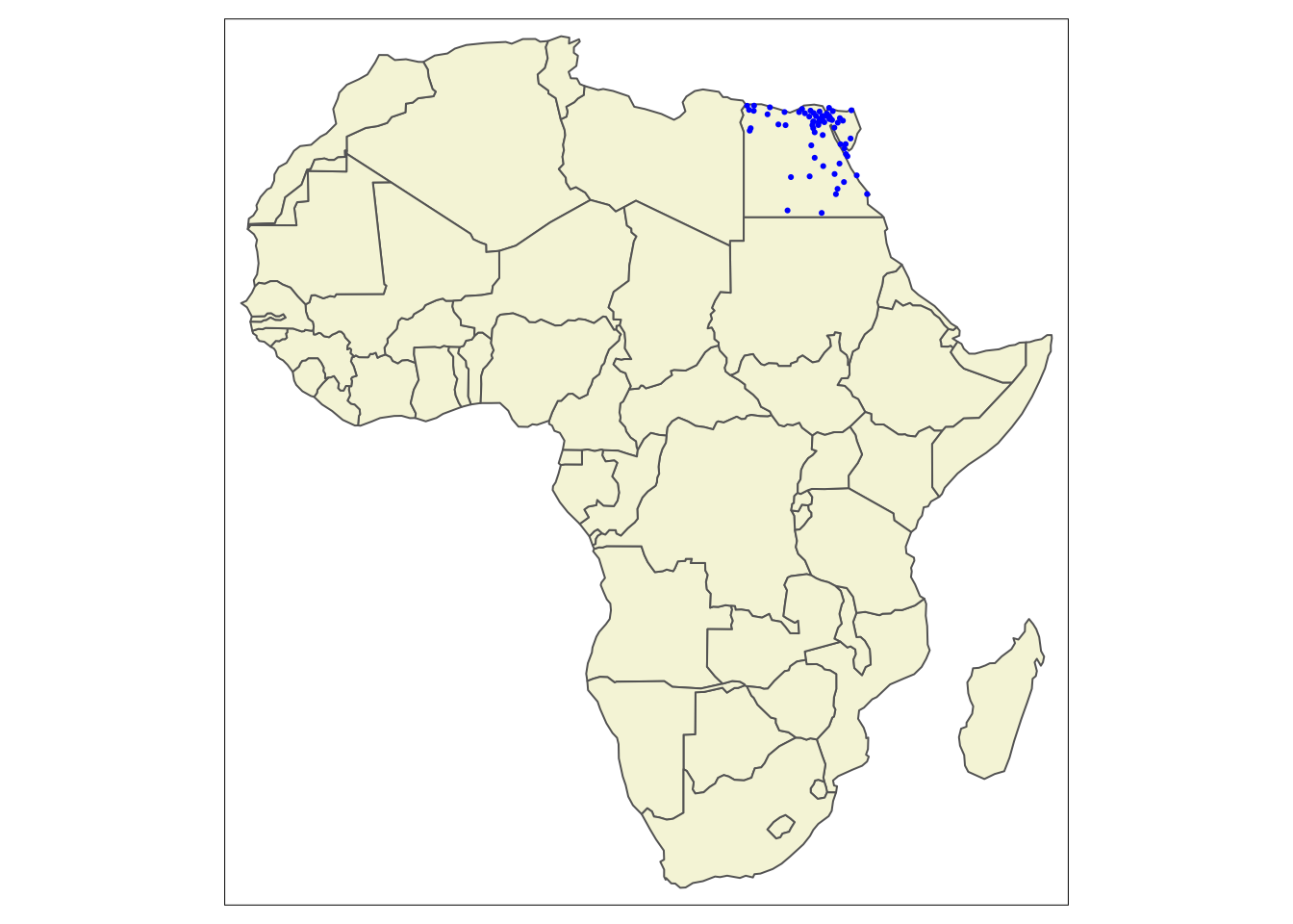
Figure 5.22: A single country airports (Egypt) visualised on a basemap.
It is also possible to visualise the different sizes of airport in the subset data. It is done exactly the same way as in the case of the whole dataset, where the colour of the dots are set to column name that contains the size of the airport. The code within tm_dots() function adjusts the colour and size of the airport dots and adds the legend.
tm_shape(africountries)+
tm_polygons(col = "lightyellow")+
tm_shape(egypt) +
tm_dots(col = "type", shape = 21,size = 0.1, title = "Airport size",
labels = c("Large", "Medium", "Small"),
palette=c(large_airport='red', medium_airport='yellow', small_airport='blue'))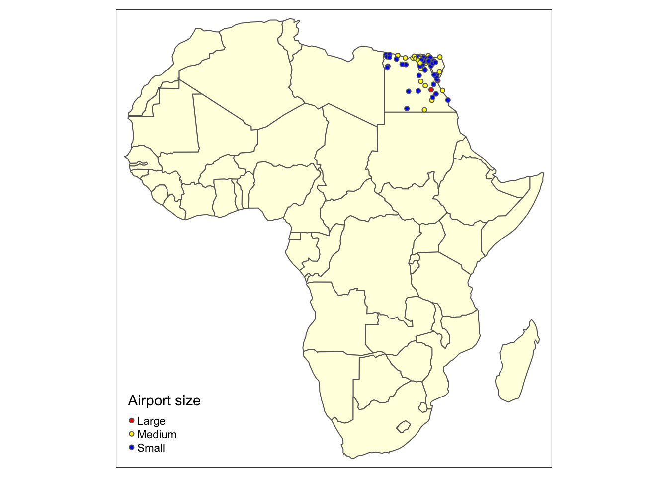
Figure 5.23: Categorical variables visualised for a subset of data.
However, it can also be observed that the view of the map is quite zoomed out and some of the airports overlap. A possible solution to this problem would be to subset both, airports of Egypt as well as the country borders so that only map of Egypt is visible. This allows for taking a closer look at location of the Egyptian airports. The rest of the code is identical to that above. The additional component of tm_layout() is used to control the position of the legend of the map. It is needed here as the legend was overlapping with the map in the default position (bottom, left corner).
egypt_map=africountries %>%
filter(`name_long` == "Egypt")
tm_shape(egypt_map)+
tm_polygons(col = "lightyellow")+
tm_shape(egypt) +
tm_dots(col = "type", shape = 21, size = 0.2, title = "Airport size",
labels = c("Large", "Medium", "Small"),
palette=c(large_airport='red', medium_airport='yellow', small_airport='blue'))+
tm_layout(main.title = "Egypt", main.title.position = c("center", "top"), legend.position = c("right", "top"),)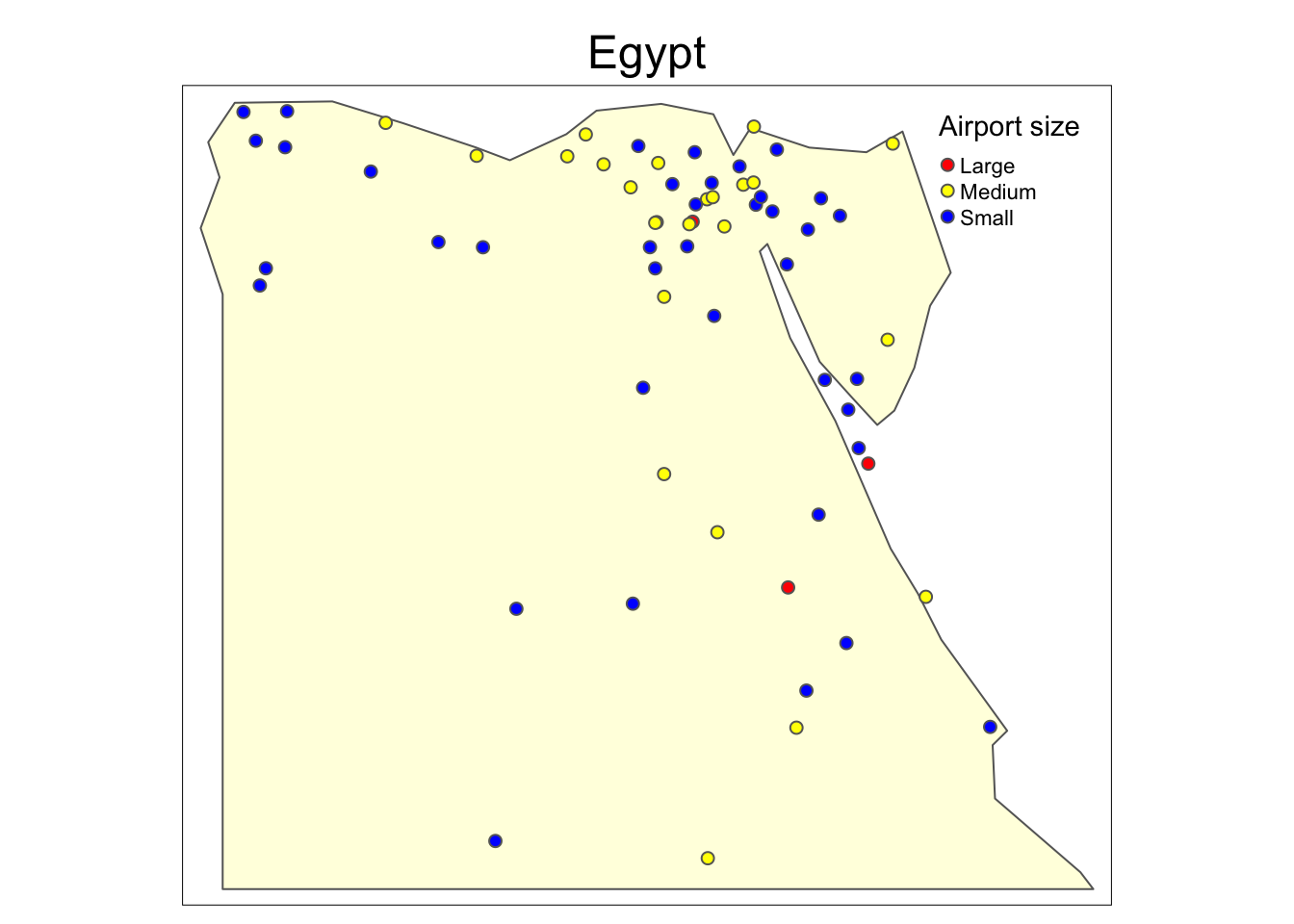
Figure 5.24: A map of Egypt (close-up view).
5.3.3.2 Spatial subsetting
Another interesting way to subset that data is spatial subsetting which allows us to achieve similar results as above, when we do not have an attribute in the dataset that could be used for attribute-based subsetting. Spatial subsetting enables us to select information in one dataset (e.g. road network, rivers, airports cities) given the spatial information from another dataset, given that both datasets contain them. Importantly, to specify the polygons of country of interest, we can use attribute-based subsetting by country name and then use them for spatial subsetting (once we have only spatial information on the selected country). The process flow has been demonstrated in the diagram and the annotation corresponding to the diagram has been used in the example below.
Figure 5.25: Process of spatial subsetting
We again choose Egypt as our example but any other country from the dataset can be used instead (see exercise below). For the ease of use, we create a variable country_name that contains our chosen country. We then, create country_polygon variable which subsets our chosen country based on country_name. It can, subsequently, be used in combination with other datasets to subset them based on spatial information that both contain. For instance, we subset airports of Egypt using spatial data of this country contained in country_polygon. In particular, country_airports data frame is created where spatial condition for subsetting (country_polygon) is provided in square brackets and target dataset (that contains data to be subset) is defined in front of it. Following this pattern: object_to_subset[ object_to_subset_by, ], the Egyptian highways can be subset. The airports and highways of Egypt are later visualised on two separate maps using tmap as we did before.
#STEP 1:
#Setting country name to the country of interest
country_name = "Egypt"
#Choosing spatial information of the country of interest
country_polygon = africountries %>% filter(name == country_name)
#STEP 2:
#Spatial subset of airports
country_airports = afriairports[country_polygon, ]
#STEP 3:
#Visualise airports of Egypt
tm_shape(country_polygon)+
tm_polygons()+
tm_shape(country_airports)+
tm_dots()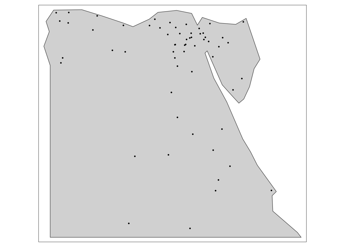
Figure 5.26: The airports of Egypt (spatially subset).
#STEP 1:
#Setting country name to the country of interest
country_name = "Egypt"
#Choosing spatial information of the country of interest
country_polygon = africountries %>% filter(name == country_name)
#STEP 2:
#Spatial subset of highways
country_highway <- afrihighway[country_polygon, ]
#STEP 3:
#Visualise highways of Egypt
tm_shape(country_polygon)+
tm_polygons()+
tm_shape(country_highway)+
tm_lines()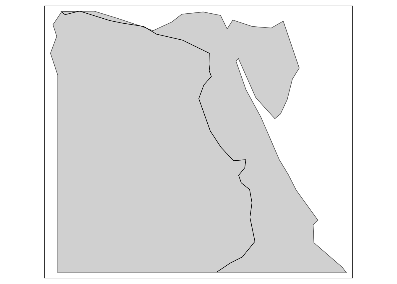
Figure 5.27: The highways of Egypt (spatially subset).
Then, we can spatially subset several polygons at the same time. In such case, we need to slightly change the code inside the filter function, where we previously used filter(name == country_name) for a single polygon and now we need %in% operator, such that filter(name %in% country_names). %in% allows us to identify if there are matching values between two objects. These can be, for example, two vectors (of different lengths) and/or data frames. Essentially, the use of %in% enables us to answer the following question: Is there any value in the first object (here name) that matches values in the second object (here country_names)?. It then gives condition for filtering operation. After that we follow the usual way of spatial subsetting.
library(dplyr)
#Create vector with countries of interest
country_names <- c("Nigeria","Cameroon","Niger")
#Filter out the countries to get their spatial data
country_polygons <- africountries %>% filter(name %in% country_names)
#Based on the spatial data subset highways
country_highways <- afrihighway[country_polygons, ]
#Visualise highways of the selected countries
tm_shape(country_polygons)+
tm_polygons()+
tm_shape(country_highways)+
tm_lines()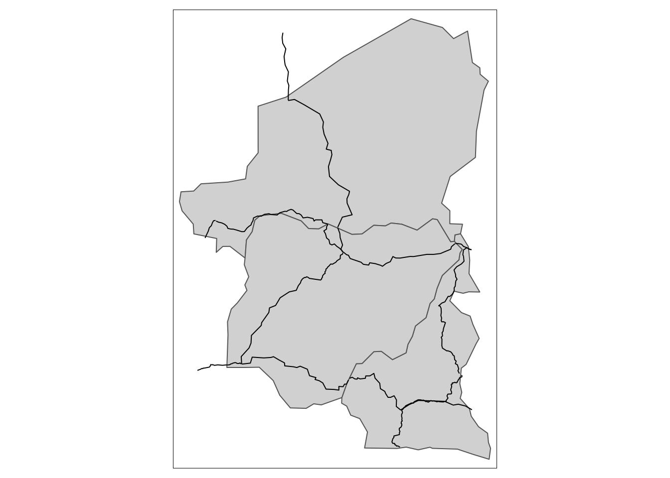
Figure 5.28: An example of spatial subsetting of multiple countries simultaneously.
#Make the map clearer to read
tm_shape(country_polygons)+
tm_polygons(col = "name", title = "Country")+
tm_shape(country_highways)+
tm_lines()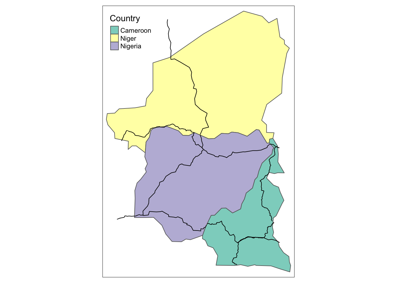
Figure 5.29: An example of spatial subsetting of multiple countries simultaneously.
5.3.3.3 Subsetting with st_bbox() function
Alternatively, it is also possible to zoom the map in by cropping it along the coordinates. This can be done using st_crop() function where we need to specify boundary longitude and latitude in degrees along which the map will be clipped. We can obtain the boundary coordinates of our map by running st_bbox() function. We then specify arbitrary values along which we want to split the map in the st_crop() function where the min and max x correspond to longitude values and max and min y correspond to latitude. We present how this can be done in the example below where we focus only on the Western Africa.
## xmin ymin xmax ymax
## -17.6 -34.8 51.1 37.3west <- st_crop(africountries, xmin = -17, xmax = 21,
ymin = -25, ymax = 21)
tm_shape(west)+
tm_polygons()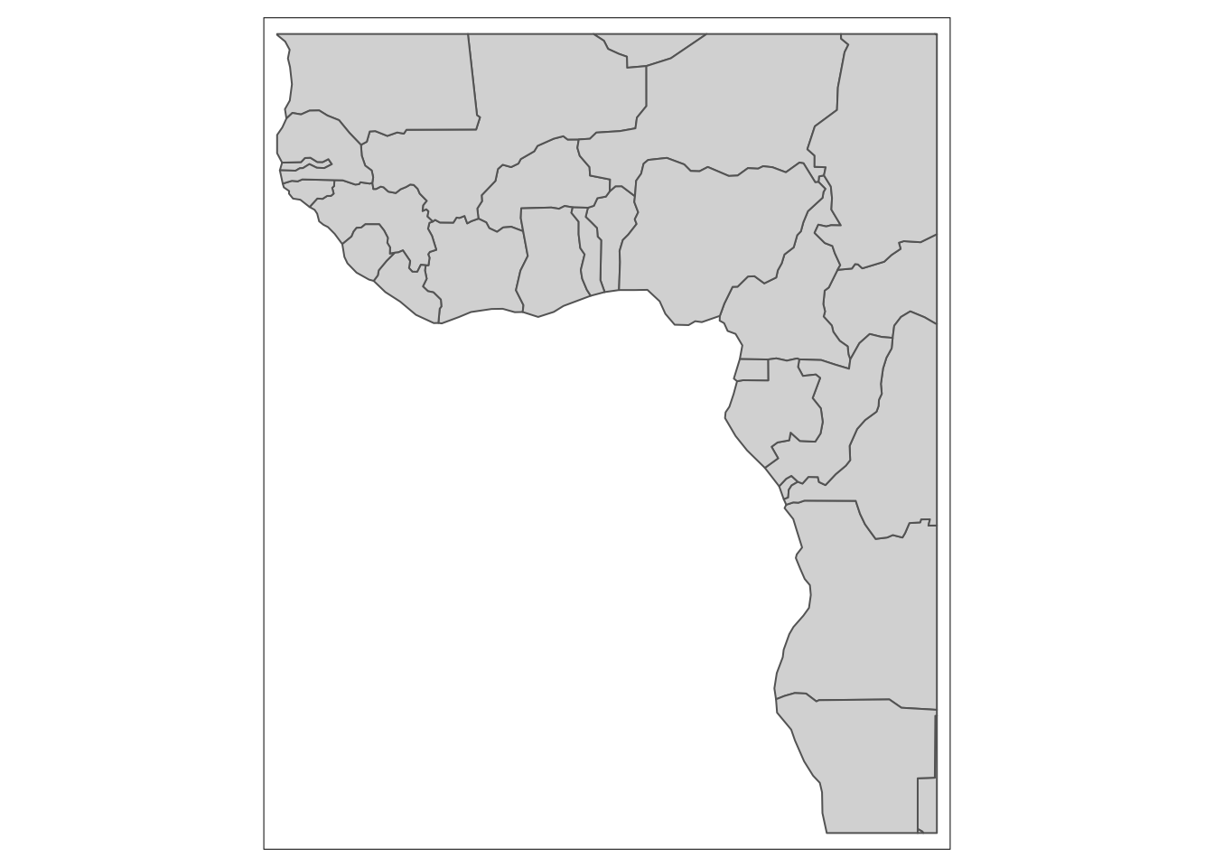
Figure 5.30: An example of map cropped along the coordinates.
Similarly, it is possible to subset airport depending on their location. In the example below we aim to split African airport into four regions: north, south, east and west.
west_airports <- st_crop(afriairports, xmin = -17, xmax = 21,
ymin = -25, ymax = 21)
east_airports <- st_crop(afriairports, xmin = 22, xmax = 50,
ymin = -25, ymax = 21)
south_airports <- st_crop(afriairports, xmin = 15, xmax = 35,
ymin = -34, ymax = -25)
north_airports <- st_crop(afriairports, xmin = -16, xmax = 37,
ymin = 20, ymax = 37)
w = tm_shape(africontinent)+
tm_polygons()+
tm_shape(west_airports)+
tm_dots()
e = tm_shape(africontinent)+
tm_polygons()+
tm_shape(east_airports)+
tm_dots()
n = tm_shape(africontinent)+
tm_polygons()+
tm_shape(north_airports)+
tm_dots()
s = tm_shape(africontinent)+
tm_polygons()+
tm_shape(south_airports)+
tm_dots()
tmap_arrange(n,s,e,w)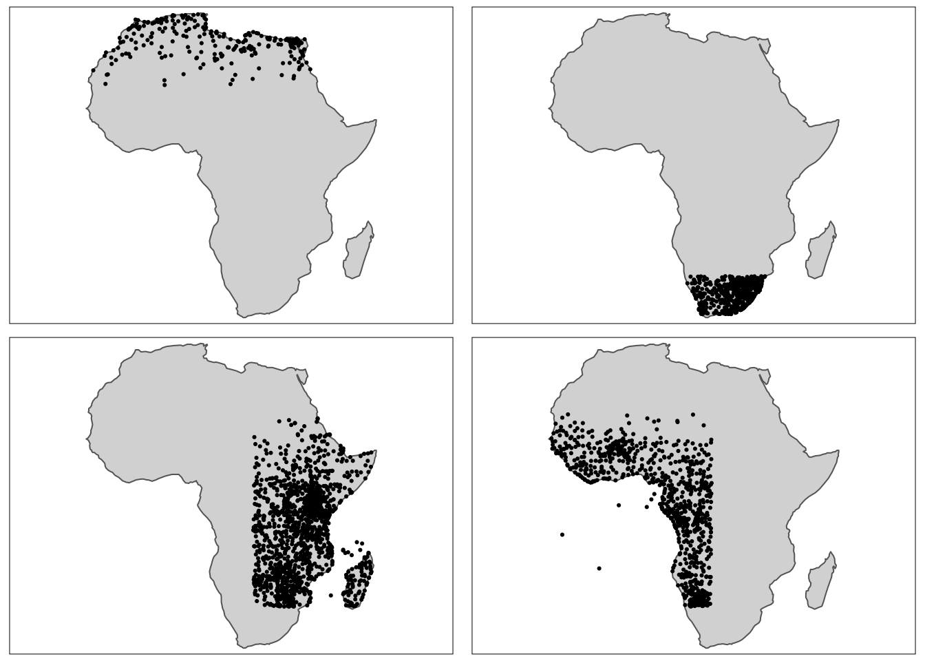
Figure 5.31: Subsetting of airports using st_bbox() function.
Subsequently, they can be visualised on a single map and differentiated by a colour. This requires a base map with a continent shape and repetitive addition on all the layers with airports.
tm_shape(africontinent)+
tm_polygons()+
tm_shape(south_airports)+
tm_dots(col = "red")+
tm_shape(north_airports)+
tm_dots(col = "blue")+
tm_shape(east_airports)+
tm_dots(col = "green")+
tm_shape(west_airports)+
tm_dots(col = "yellow")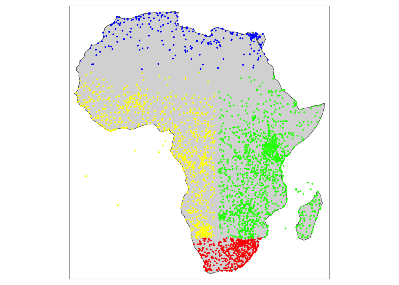
Figure 5.32: Subset airports in a single map.
Finally, to control for the zoom-in level it is also possible to use an interactive map to freely zoom in and out. This will be presented in the following section of the book.
Special type of spatial subsetting is subsetting of raster data. We start similar to regular spatial subsetting where we specify the polygon that we are interested in. Then, we crop our raster data to match the polygon and using rasterize() function we transfer values associated with spatial object to raster cells and finally with mask() function we create a raster version of the subset country (zevross.com,2015).
country_name = "Madagascar"
country_polygon = africountries %>% filter(name %in% country_name)
#raster data subsetting
cropped<-crop(afripop2020, country_polygon) #cropping raster data to match our polygons
raster_country<-rasterize(country_polygon, cropped) #transfers values associated with spatial object to raster cells
raster_subset<-mask(x = cropped, mask = raster_country) #create raster version of the country
#map of subset country
tm_shape(raster_subset) +
tm_raster()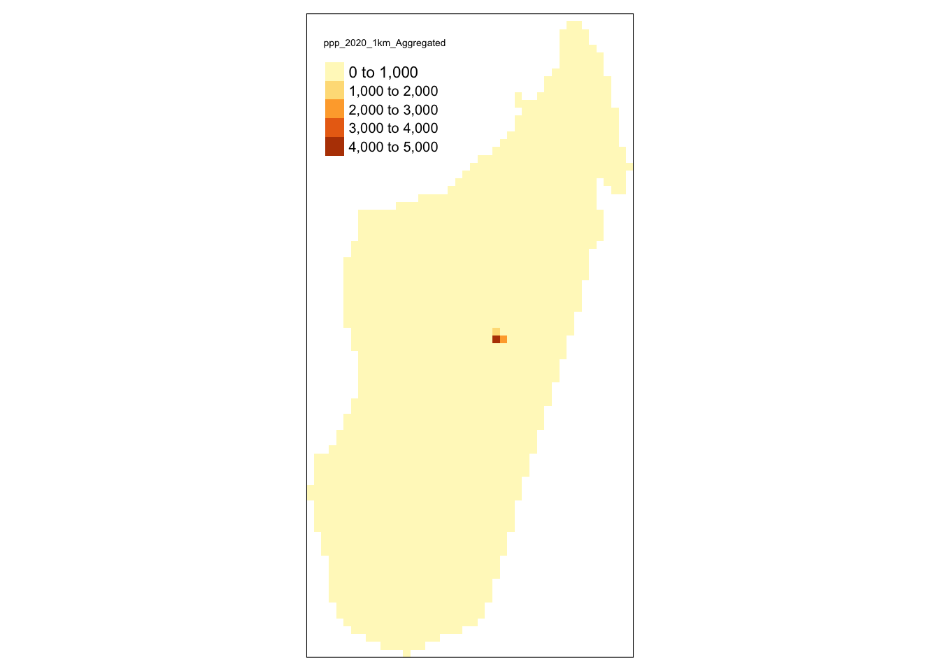
Figure 5.33: Raster data with default breaks - subset for a single country.
#improved visibility by the use of customised breaks
custom_breaks = c(0,1,10,100,1000,15000,25000)
tm_shape(raster_subset) +
tm_raster(breaks = custom_breaks)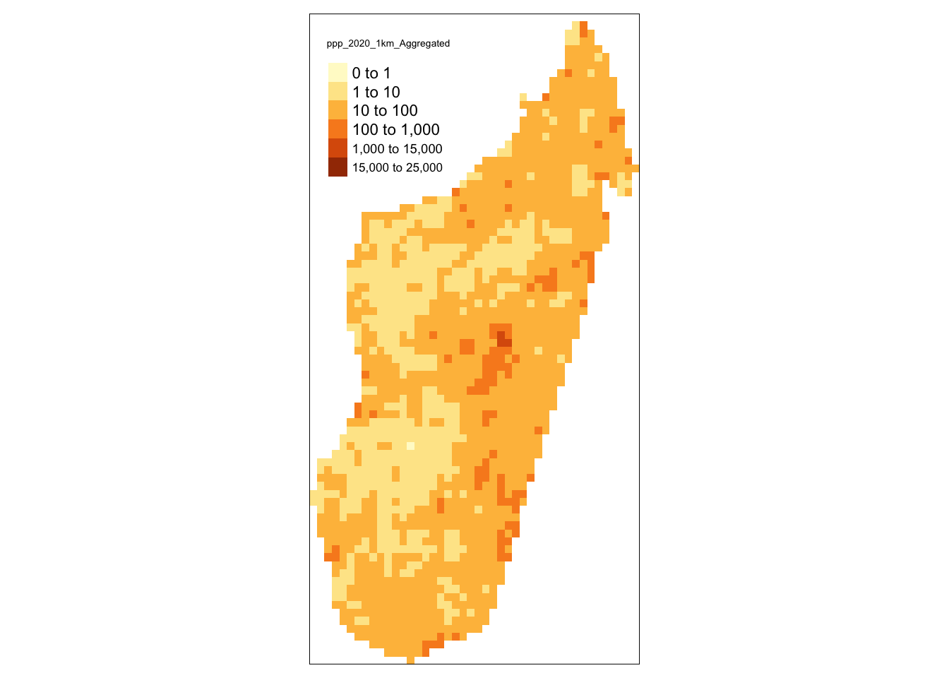
Figure 5.34: Raster data with default breaks - subset for a single country.
The solutions to the exercises are provided at the end of the chapter.
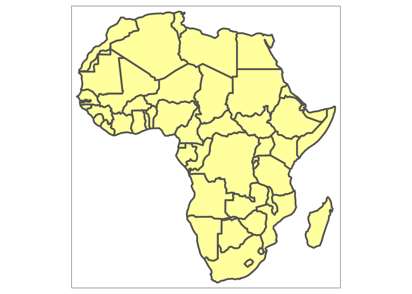
Exercise 2: Plot a yellow map of Africa with transparency of 0.4 and solid line borders of width 3.
Exercise 3: Plot a light blue map of Africa with dotted, non-transparent, red borders.
Exercise 4: Plot a map that has polygons filled with gross domestic product, black borders, legend titled “GDP” and customised breaks at 0, 20000, 30000, 40000, 50000, 100000, 200000, 300000, 500000.
Exercise 5: Create a map with continent contour in light green colour. Then add African highways by using afrihighway dataset. Finally, include a title on the bottom of the map.
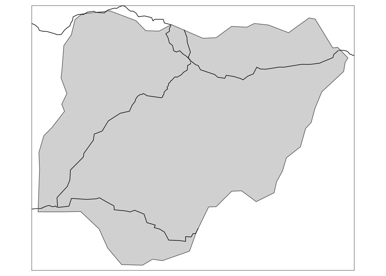
Exercise 6: Using spatial subsetting create maps of highways and airports for Nigeria.
5.4 Interactive maps with tmap
The mapview is not the only package that allows us to produce interactive maps. Another possibility is the tmap package that offers versatility not only for creating static maps, as we have seen above, but it also allows for making customised interactive maps conveniently, by simply changing the mode of operation from static to dynamic using plot or view, respectively in tmap_mode() function. After the activation of an interactive mode all the maps produced with tmap will be interactive. Therefore, we are able to create all the maps that we have produced so far in an interactive version.
## tmap mode set to interactive viewingtm_shape(africountries)+
tm_borders()+
tm_shape(africapitals)+
tm_dots(col = "white", border.col = "blue", size = 0.1)+ #capital dots settings
tm_text("capitalname")+ #adds capital names
tm_shape(afrihighway)+
tm_lines(col = "red", lwd = 2, alpha = 0.7) #highway lines settingRegardless of the mode, the creation of maps using tmap package is easy and convenient. The additional feature in the interactive mode is the choice of the background map. This can be set up using function tm_basemap. The available base maps can be accessed using leaflet::providers. They can also be previewed here. In the example below, we use a topographic map of Africa.
tm_basemap("OpenTopoMap")+
tm_shape(africountries)+
tm_borders()+
tm_shape(africapitals)+
tm_dots(col = "black")+ #capital dots settings
tm_shape(afrihighway)+
tm_lines(col = "red", lwd = 2, alpha = 0.7) #highway lines settingFinally, we arrive to visualisation of subset of data in an interactive mode. This only requires change of the view mode similar to examples above.
tm_shape(africountries)+
tm_polygons()+
tm_shape(egypt) +
tm_dots(col = "type", shape = 21, size = 0.2, title = "Airport size",
labels = c("Large", "Medium", "Small"),
palette=c(large_airport='red', medium_airport='yellow', small_airport='blue'))Exercise 7: Create an interactive map uses watercolour theme, the highways are blue and dots denoting capitals are white with black borders. Finally, add capital names.
Exercise 8: Create an interactive map of African countries which have population smaller than 10 million. Fill the polygons with the population size.
5.5 Further resources
5.6 Summary
In this chapter we looked at how to produce static and interactive maps using different packages. Specifically, we saw that the tmap package is a flexible tool to create maps with a stepwise approach, where we can add different layers to our maps. It is equally easy to switch between static and interactive maps. Further, mapview was showed to be a quick solution for creating interactive maps.
5.7 Exercises solutions
- Exercise 1
- Exercise 2
- Exercise 3
tm_shape(africountries)+
tm_fill(col = "lightblue")+
tm_borders(col = "red", lty = "dotted", alpha = 1)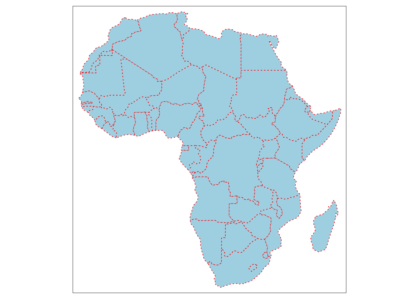
- Exercise 4
custom_breaks = c(0, 2, 3, 4, 5, 10,20, 30, 50) * 10000
tm_shape(africountries)+
tm_polygons(col = "gdp_md_est", title = "GDP", breaks = custom_breaks)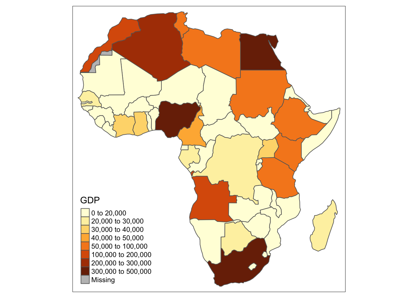
- Exercise 5
map_contour = tm_shape(africountries)+
tm_fill(col = "lightgreen")
data(afrihighway)
map_contour +
tm_shape(afrihighway)+
tm_lines()+
tm_layout(title = "Highways in Africa", title.position = c("center", "bottom"))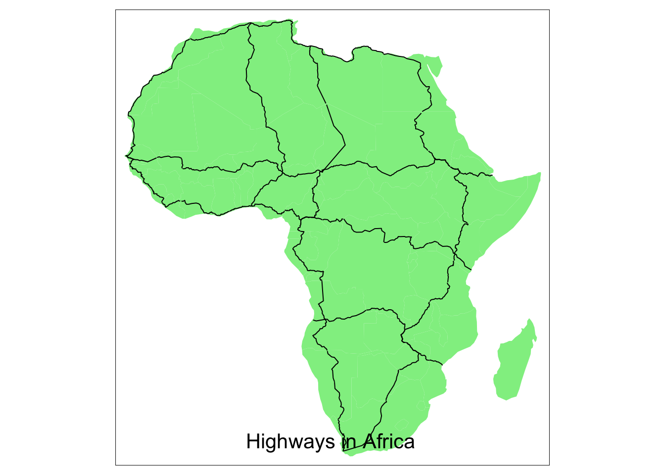
- Exercise 6
#Example country: Nigeria
country_name = "Nigeria"
country_polygon = africountries %>% filter(name == country_name)
#Spatial subset of airports
country_airports = afriairports[country_polygon, ]## although coordinates are longitude/latitude, st_intersects assumes that they are planar
## although coordinates are longitude/latitude, st_intersects assumes that they are planar## although coordinates are longitude/latitude, st_intersects assumes that they are planar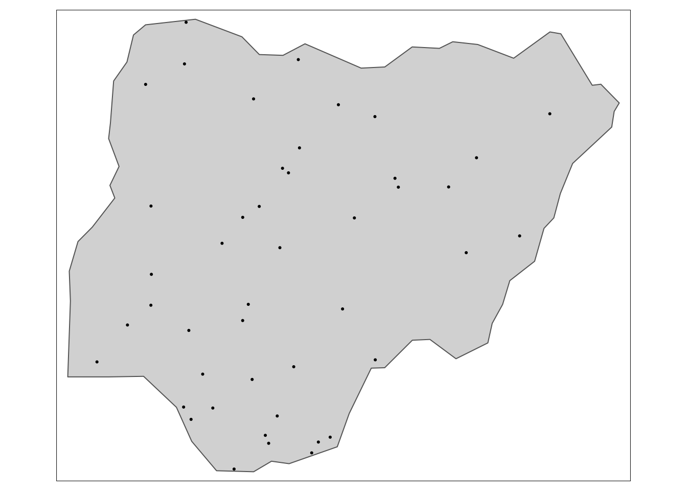
- Exercise 7
## tmap mode set to interactive viewingtm_basemap("Stamen.Watercolor")+
tm_shape(africountries)+
tm_borders()+
tm_shape(africapitals)+
tm_dots(col = "white", border.col = "black")+ #capital dots settings
tm_text("capitalname", size = 1.2)+
tm_shape(afrihighway)+
tm_lines(col = "blue", lwd = 3) #highway lines setting- Exercise 8
## tmap mode set to interactive viewing